AUSTIN + SHENICE, BEACHSIDE DOJO
One of the greatest things about being a wedding stylist is the relationships that we build with our clients. There is so much more to styling a wedding than hiring a bunch of props and furniture and project managing that the event space looks perfect. Unknown to most couples prior to engaging us for our services, we spend a lot of time to get to know you so that we can design a wedding that reflects you.
For Austin & Shenice, they had been in a long distance relationship for many years. Their love story wasn’t always easy and this made us want to go the extra mile for them.
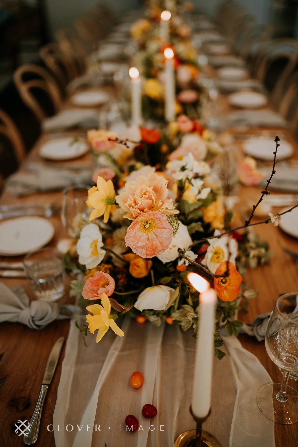
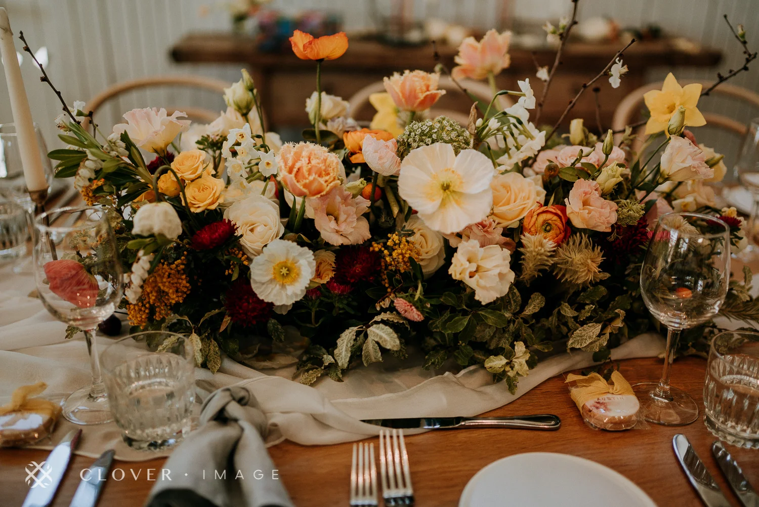
We decided that a ‘mid-summer harvest’ theme would reflect them best and designed the wedding ceremony and reception space to reflect this concept that their commitment and sacrifices were finally coming to fruition. Hence, the harvest.
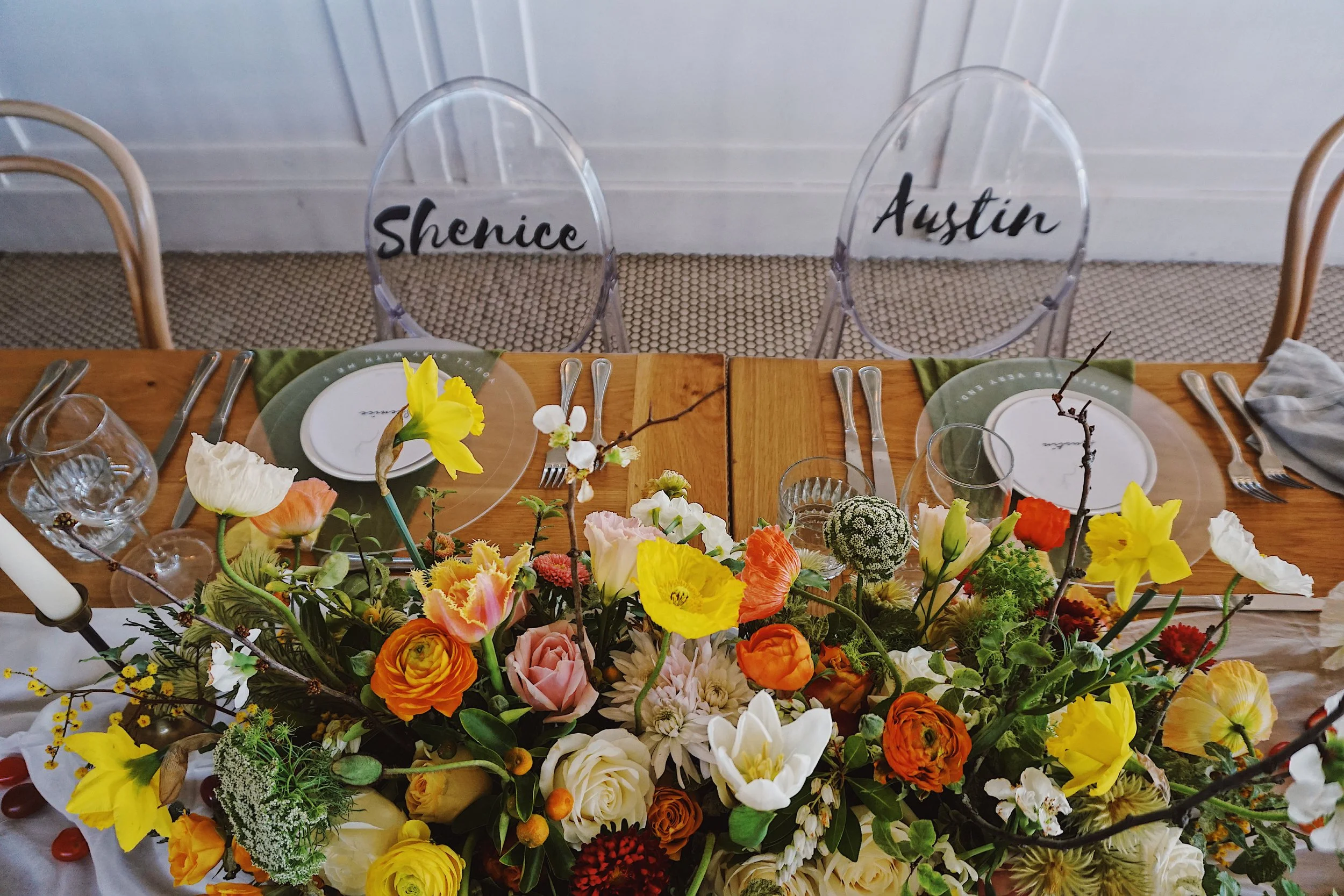
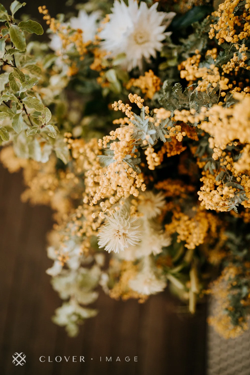
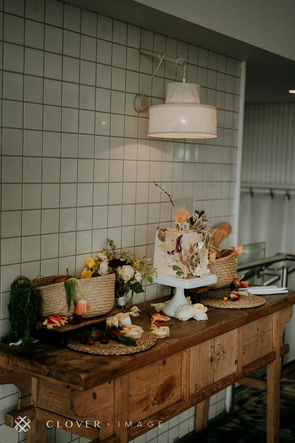
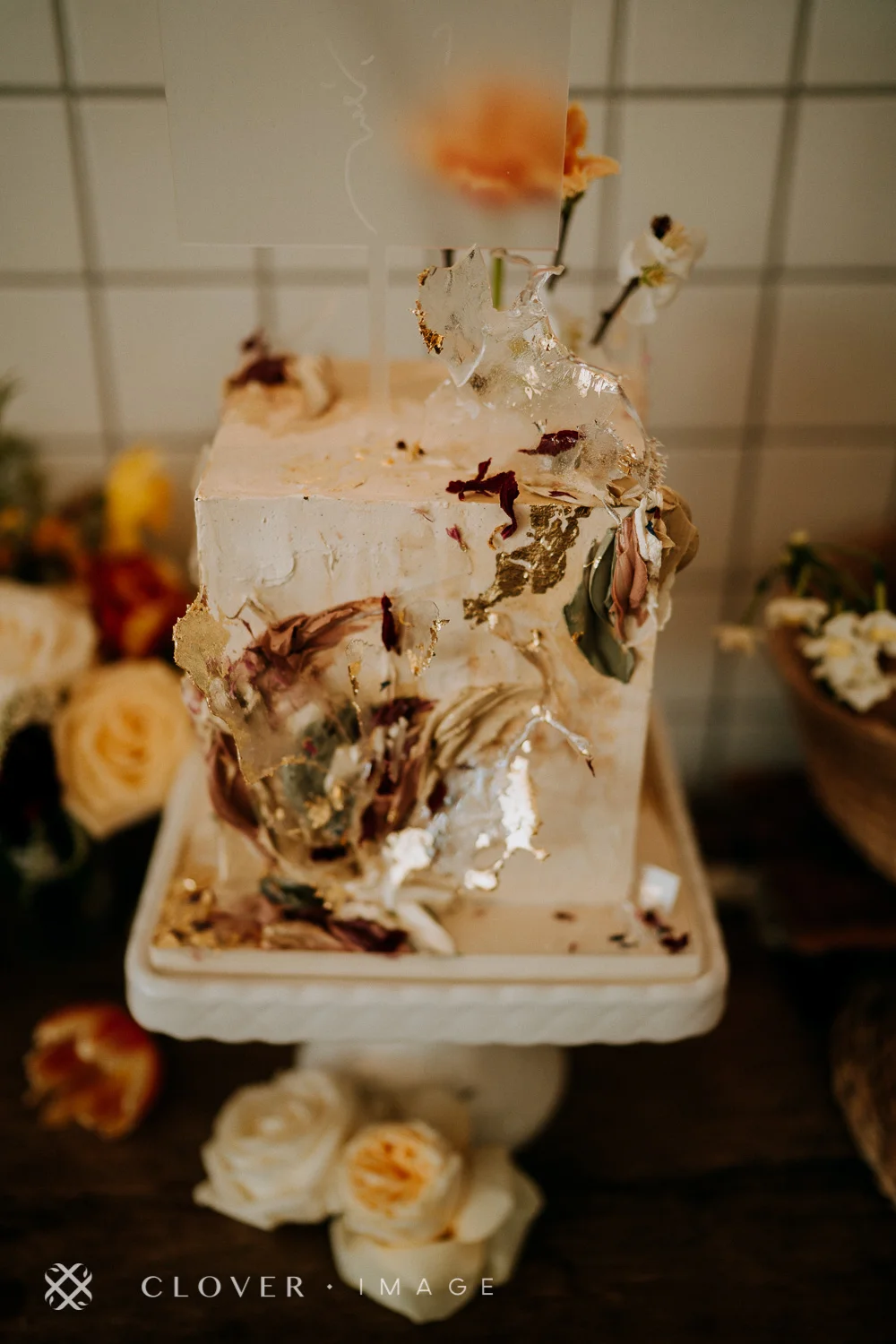
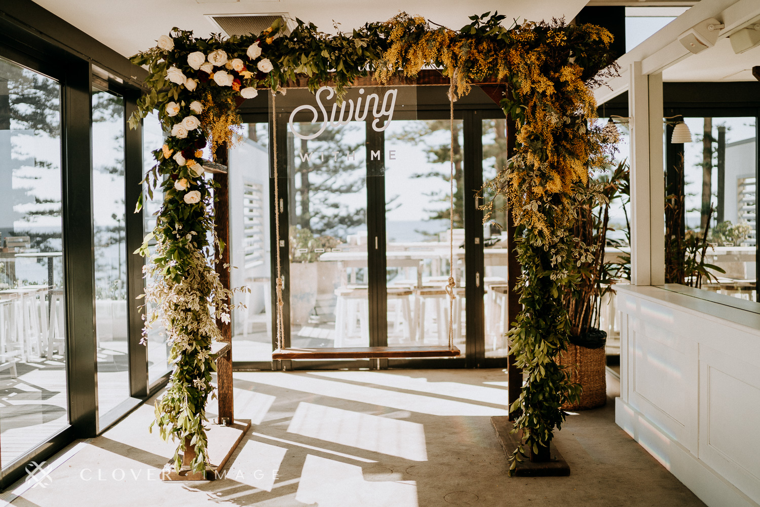
As you can see, we used fruits and vegetables to reinforce the concept of a harvest. Warm peachy, yellow and orange tones were chosen to reflect autumn colours. This bright and bold colour palette was replicated across to all the florals - from those featured in the arch to table centrepieces.
We recommended Beachside Dojo as their wedding ceremony and reception venue, partly due to their intimate wedding guest numbers and secondly, due to having Manly as a natural backdrop for their wedding day.
Originally, Shenice approached us with a dark and moody concept. After a site visit, we proposed a completely different colour palette to work with the existing layout and available lighting of Beachside Dojo.
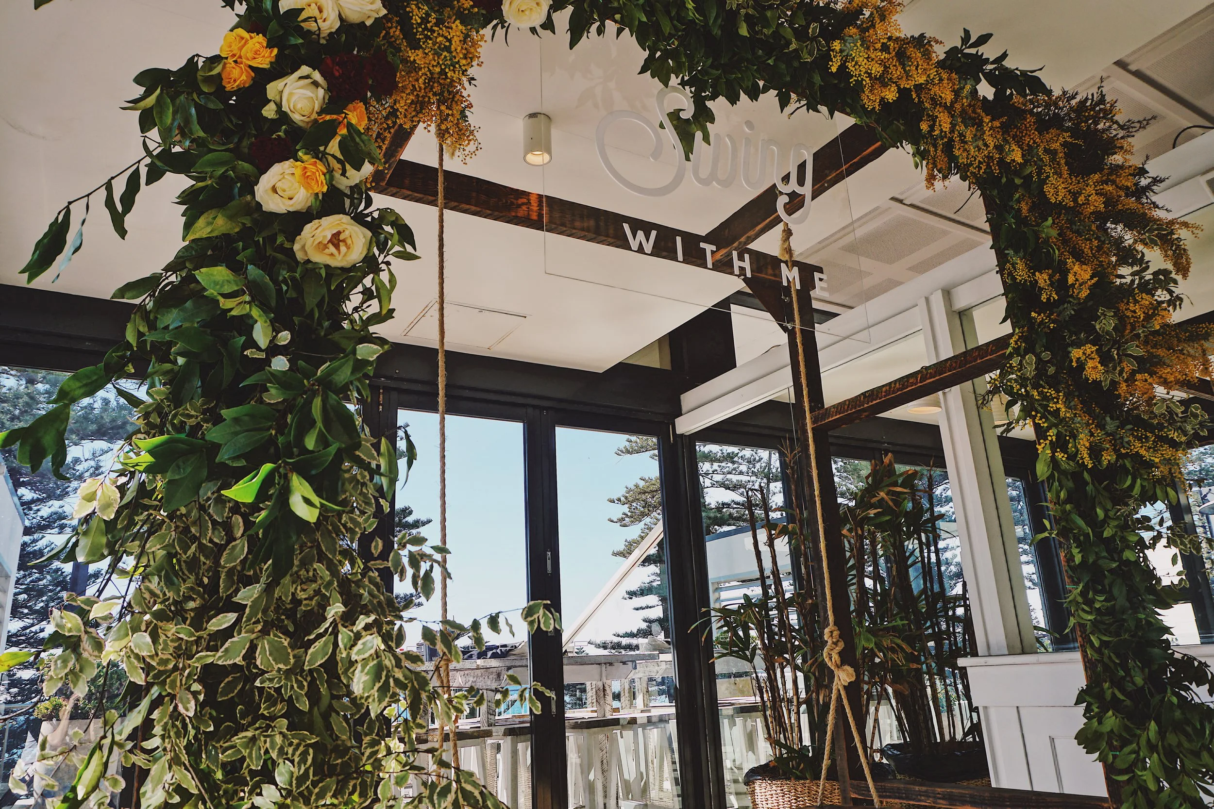
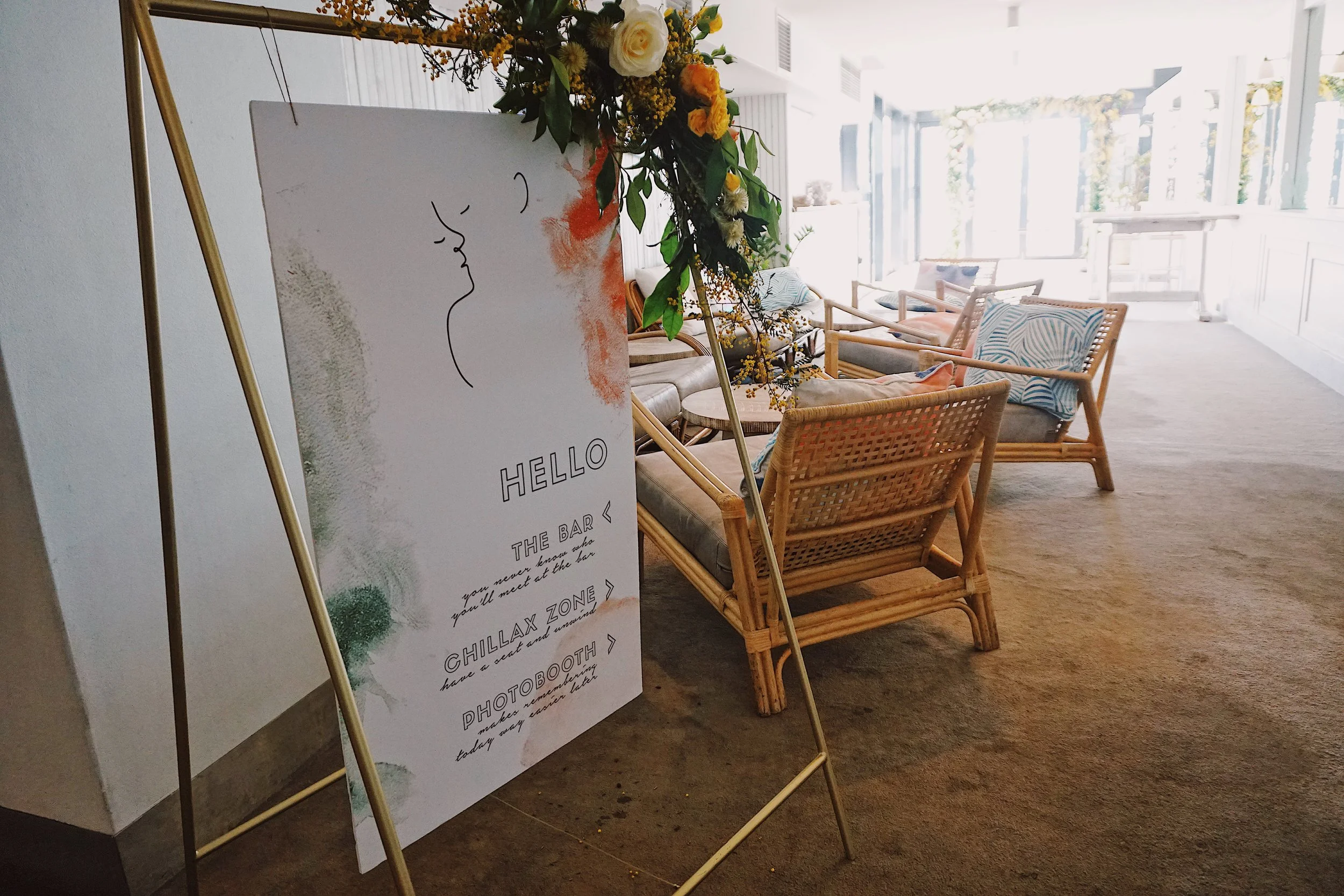
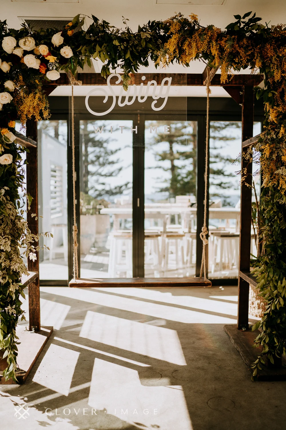
We love providing interactive elements for guests to enjoy so we designated an area as a general chill-out zone for guests to chat with each other as well as an open booth swing to keep the selfies rolling.
Who doesn’t love taking selfies with a beautiful backdrop?
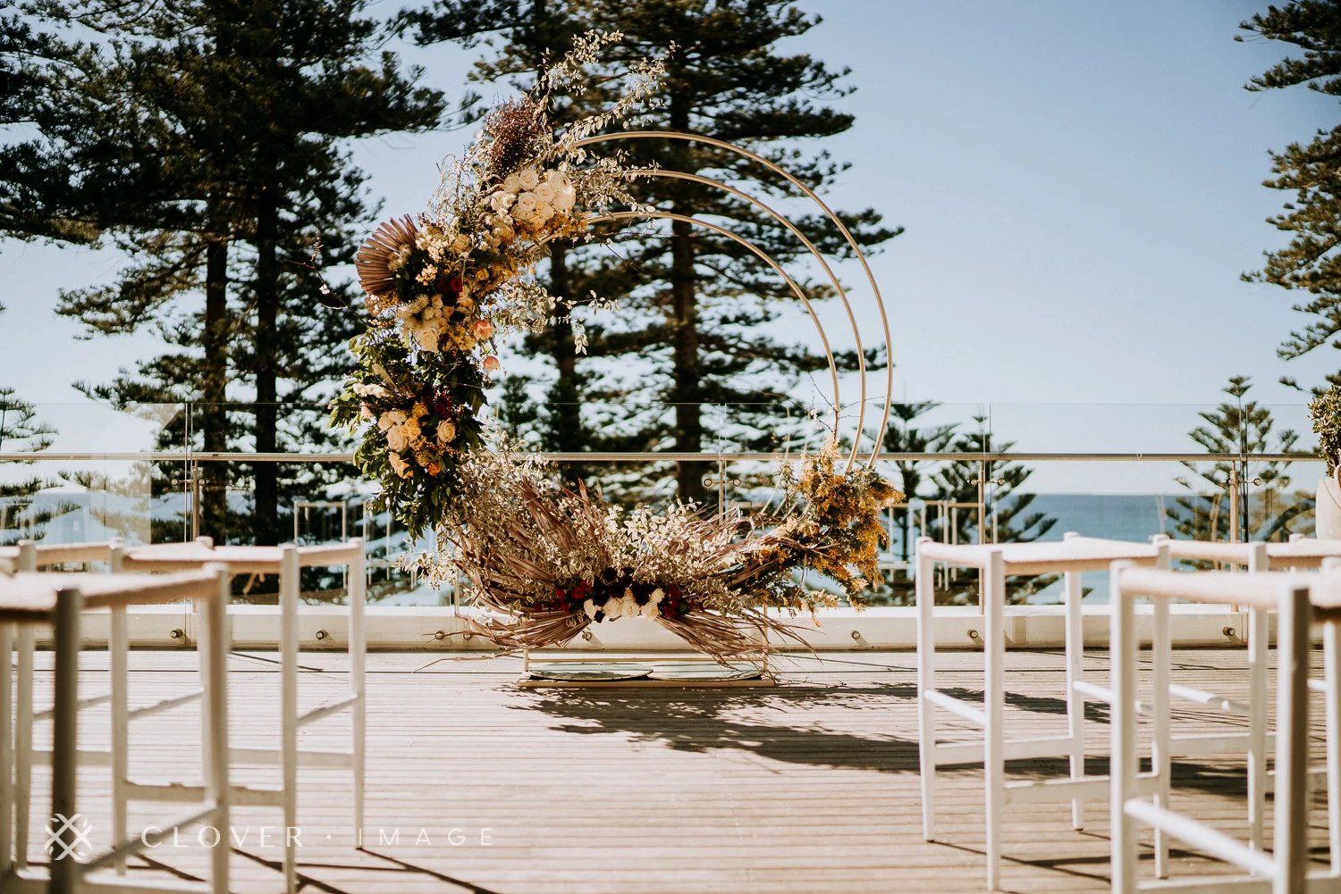
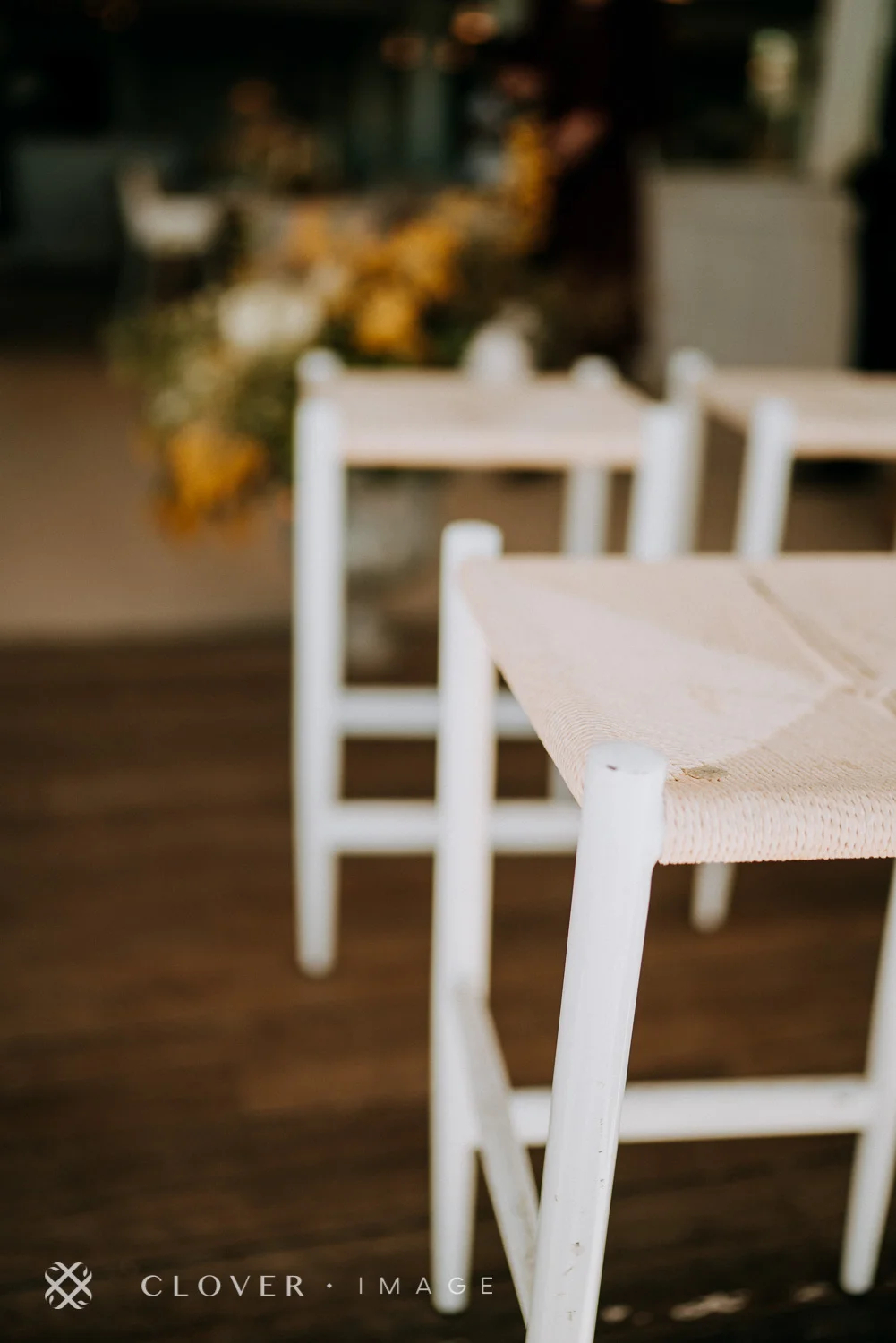
As for the ceremony set up at Beachside Dojo, we kept it as simple as possible so that the backdrop of Manly could shine through. It would be silly to hide such a beautiful view. We also used the venue’s dining chairs as ceremony chairs.
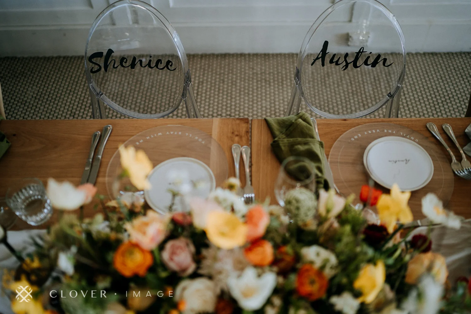
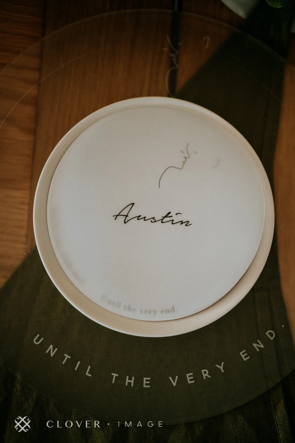
For extra personalisation, we brought in ghost chairs for the bride and groom. On each of the ghost chairs, we had their names printed on a custom designed decal and stuck onto the transparent chairs for some visual oomph.
But personalisation didn’t end there.
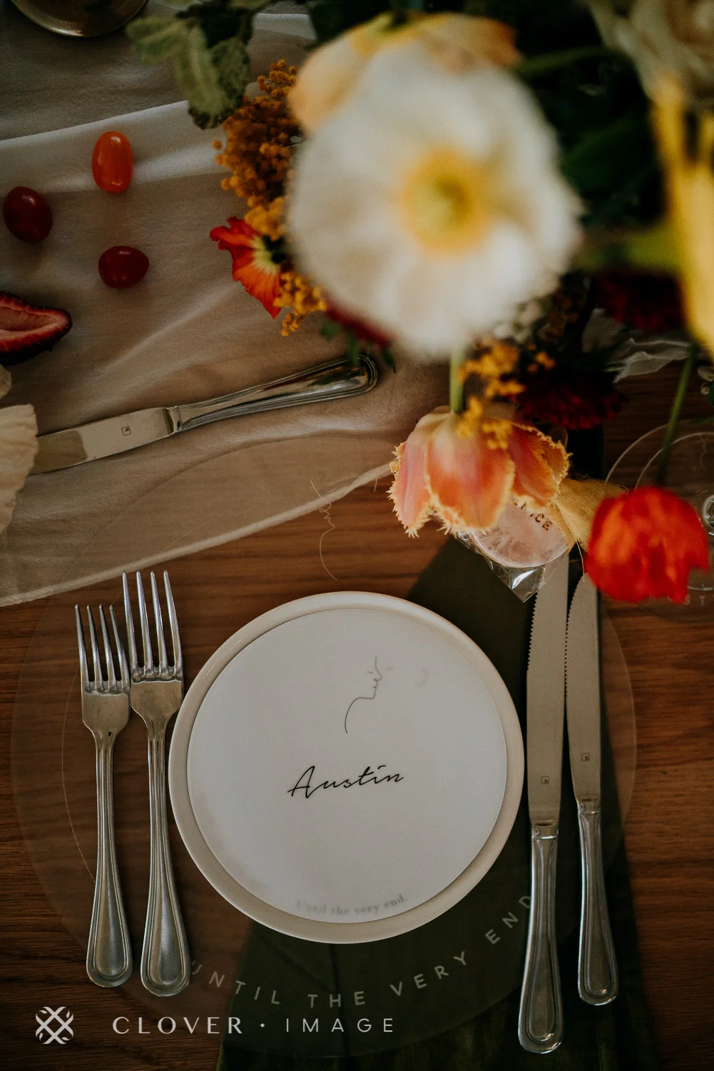
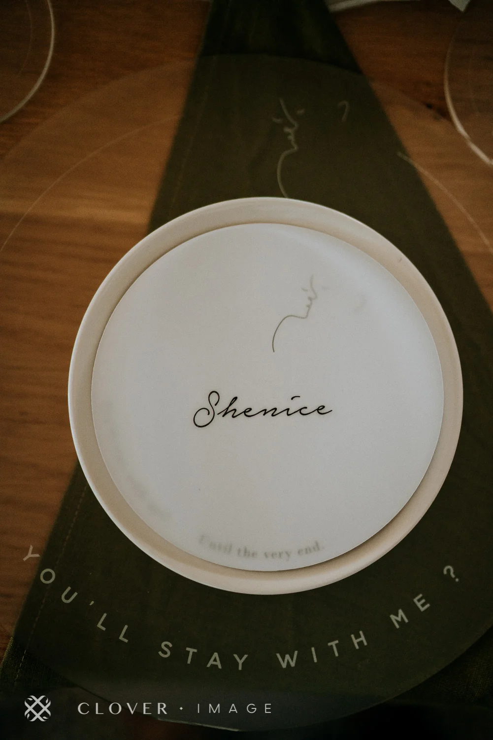
We designed a bespoke wedding logo just for them that was replicated on the welcome sign, cake topper, and one-of-a-kind acrylic charger plates.
Photo Credit: Clover Image
Like what you saw? Find out about our wedding styling and contact us here and we’ll email you our latest info pack.
